DNN 101 Guide
Created October 2023
Overview
Designed to be both a quick-reference resource and a training tool, this guide constains insights into common DNN tasks and backend featues, step-by-step instructions for common HTML tasks and tips for users.
Table of Contents
Restore a Deleted Page/Module. 14
2. Proper File/Folder Naming. 21
DNN Admin Toolbar
Left-Hand Admin Toolbar
Upon logging into DNN as an administrator you will see the admin toolbar on the left-hand side of the screen.
The first icon is the Content Menu, where you can manage the pages of the website and access the Recycle Bin. The Recycle Bin stores all of the pages and modules that have been deleted from the website. The pages are discussed in detail beginning on page 12.

The second icon is the Manage Menu. There are several functions listed in this menu, but the main one to note is the Site Assets. This is the Asset/Image/File Manager in DNN where you can upload documents and images.
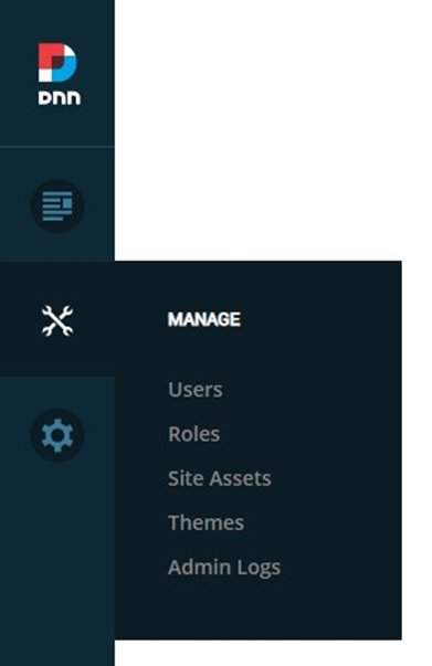
The third icon is the Settings Menu. This menu includes several backend settings for the server, database and security of the website. These settings are all configured and managed by ITS so you should not need to access or adjust anything in this menu.
Lastly, in the bottom left-hand corner, is the Edit Icon.

Bottom Admin Toolbar
If you click the Edit Icon, you will enter Edit Mode which will allow you to edit the website. You will also see an additional admin toolbar displayed at the bottom of your screen.

If you would like to remain in Edit Mode while navigating around the website, click the Edit Icon a second time to lock Edit Mode.
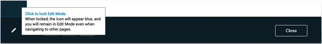
When the Edit Icon has a light blue background it means you are locked in Edit Mode.
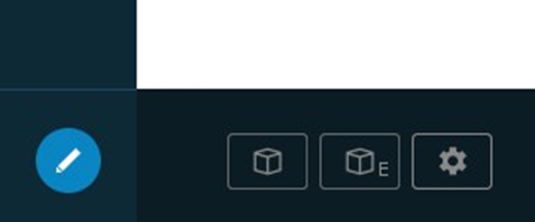
There are three buttons in the bottom admin toolbar. The leftmost button with the cube icon is the Add Module Button. This can be used to add modules to a page. This is discussed in further detail in the “Adding A Module” section beginning on page 22.
The middle button, the cube icon and the letter E, is the Add Existing Module Button. This can be used to add a copy or duplicate of a module to a page. This is also discussed in further detail in the “Adding an Existing Module” section beginning on page 22.
Lastly, the button on the right with the gear icon is the Page Settings Button. This button will take you to the Page Settings of the current page you are on.
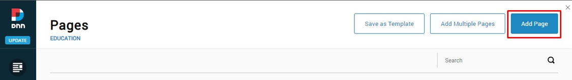
Pages
Page Structure/Hierarchy
Under the Content Icon in the left-hand admin toolbar, click on “Pages” to access all of the pages on your client’s DNN website. Once clicked, the page hierarchy will appear on the left side of the page.

Clicking the plus sign next to a page will reveal the subpages nested below it.
Additionally, menu items with a page icon to the left of the page name are pages with content. Menu items with a link icon (like Membership in the screenshot below) are linked either to another page or an external URL.
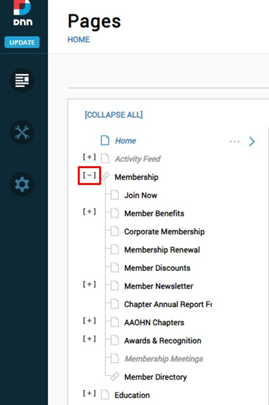
Pages listed in bold black font are visible in your website’s main navigation. Pages listed in gray italic font are not visible in the main navigation (but may be linked to in the content of a page).
When a page is selected in the listing, an options button will appear (three dots). In hovering over this button, a menu will appear allowing you to:
- Add a subpage to the selected page
- View the selected page
- Edit the selected page
- Duplicate the selected page
Note: When duplicating a page, all of the content/modules on the page will be copied over to the new page. The page title will also be carried over from the original page, but in most cases, this will need to be updated as well as the page name, description and keywords.

A page can also be added via the Add Page Button in the top right of the Pages window.
Page Settings/Setup
On the right-hand side of the Pages window, information about the selected page and the settings for the selected page can be viewed.
Page Details
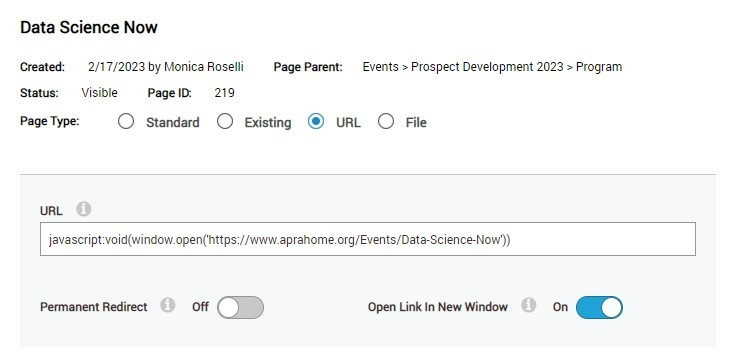
In the first tab, Details, information about the page, including when it was created, its visibility status and the page type, can be viewed.
Page Types

The different page types are:
- Standard: Used for the vast majority of pages on a client website. This is a standard page with content (copy, images, video, etc.) added to it.
- Existing:Used to link a new page to an existing page somewhere else in the navigation menu.
- Example: You want to add a blog to both the education and publications sub-menus in your website’s main navigation. To do this, you would create the blog’s page under the education sub-menu as a standard page and then add a second blog page under the publications sub-menu that links to the existing blog page under the education sub-menu.
- URL:Used to link to an external website.
- Example: Adding a link to the client’s content hub or conference microsite.
Note: On older versions of DNN (websites built prior to July 1, 2023), if you would like to have the link for a URL page type open in a new window, add the below code into the URL box of the page’s details, replacing the highlighted portion between the single quotes with your actual URL.
javascript:void(window.open('https://www.aprahome.org/Events/Data-Science-Now'))
- File: Used to link directly to a viewable/downloadable file housed on your website in the Site Assets section.
Page Settings
Below the Page Details section, are boxes for the webpage’s name, title, description, and keywords.
- Name: Copy that is added to the Name box will be displayed in the website’s navigation menu.
- Title: Copy that is added to the Page Title box will be what is displayed in the tab of the browser when visiting the page. This is also used in search engines as the title displayed in the results. A consistent naming structure is recommended. For Instance, “Current Openings | Careers | Smithbucklin” is a good page title for the Current Openings page that is nested in the Careers section of the Smithbucklin website. This should have a max of 60 characters for SEO.
- Description: Copy summarizing the content on the page accurately. Typically, this will be 1-3 sentences and for SEO purposes should be a minimum of 70 characters and a maximum of 155 characters.
- Keywords: Comme separated keywords that are included on the page, or naturally align with the content on the page. For SEO purposes these should align with phrases users are searching for, and no more than 10 should be included.

Below the Keywords box is the Tags box, which is strictly for internal website use. The Tags box should not be used for SEO.
Next to the Tags box is the Parent Page dropdown menu. When clicked, the dropdown will list the parent page (one level up in the hierarchy) of the page currently selected. If the page needs to be moved to a different section or placed below a different parent page, use the dropdown to select a new Parent Page.

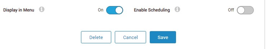
At the bottom of the Page Settings window is the Display in Menu toggle. In turning this to on (a blue color will appear in the space), you will be able to add or remove the page from the navigation menu.
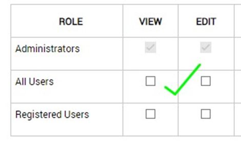
Page Permissions
On the Permissions tab, role permissions/access can be viewed/edited to the selected page. For most pages, set the page up so that all users have viewing permissions. To do this, click on the All Users box under the View column once.

If admins should only have access to the page because you are testing or still building the page out, uncheck the box next to All Users. Be sure to check the box two times so that the checkbox is empty. If the checkbox has a circle with a line through it, the page has been disabled and no one will be able to access it – including website admins.

If a website is set up with additional roles, such as Member and Non-Member, one or more of these roles can be added to the page with set permissions for said roles. However, it is recommended to set member/non-member visibility on the module’s permissions versus the page’s permissions. For additional information on module permissions, read the “Module Settings” section beginning on page 40.
Advanced Settings
On the Advanced tab, there are additional subtabs:
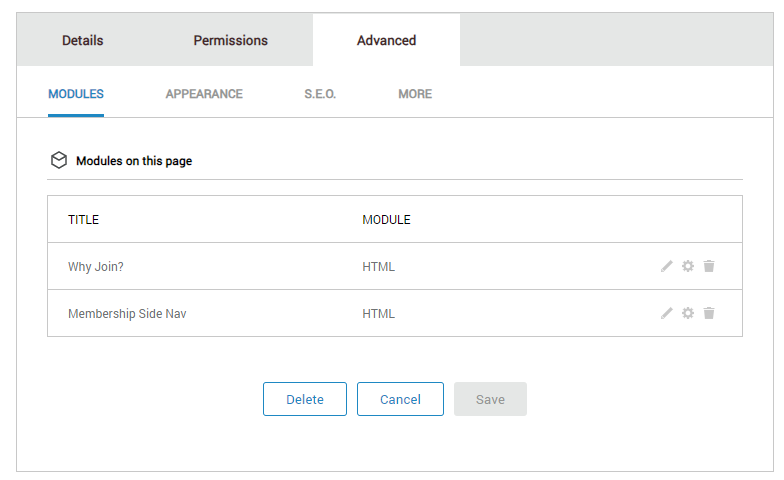
- Modules Tab: Allows one to view the different modules that have been added to the page and their titles. Modules can also be edited/deleted from this tab; however it is recommended to edit and delete modules from the page itself instead of in the settings. See the “Modules” section beginning on page 22 for more information on editing and deleting modules.
- Appearance Tab: Allows one to view the theme and layout that are applied to the page. The theme settings should not need to be changed for any page, and for most pages, the layout will be “siteskin,” which is the standard subpage layout. There may be additional layouts listed for the homepage and events page as well. Before making a change to the layout, consult your ITS client manager or the ITS Support Center.

- SEO Tab: Allows one to view the URLs for the page and add additional URLs (vanity or redirects). For more information on page URLs see the “Creating Vanity Links” section under Pages. The SEO tab is also where indexing (website crawling) can be turned on and off. The Allow Indexing toggle in the lower right-hand corner determines whether or not the page shows up in searches, both within the site itself, as well as in web searches such as Google.
- More Tab: Allows one the option to disable a page. If the disable option is toggled on, the page cannot be clicked on in the navigation. This should be used as a way to insert a placeholder navigation item for sub navigation items.
- Example: An admin wants to add a dropdown called Membership to the top-level navigation however they do not want the word Membership to be clickable. Membership in this instance would be considered a placeholder for users to hover over and see a dropdown menu of clickable items.
- Example: An admin wants to add a dropdown called Membership to the top-level navigation however they do not want the word Membership to be clickable. Membership in this instance would be considered a placeholder for users to hover over and see a dropdown menu of clickable items.
Creating Vanity Links
To create a vanity/redirect URL:
- Navigate to the S.E.O. tab under Advanced.
- Click the Add URL button to the right.
- Enter in the path you’d like for the redirect URL, for example /Convention2024
- Set the URL Type to Redirect
- Click Save.
Once the vanity link has been saved, the Site Alias is now automatically selected as the appropriate alias. If the below “Selected Site Alias Usage” popup appears, the alias selected is not correct. Select a different alias from the dropdown until the popup is gone.
Recyclng Bin
Under the Content icon in the left-hand admin toolbar is the Recycle Bin, which stores all of the deleted pages and modules on the website.
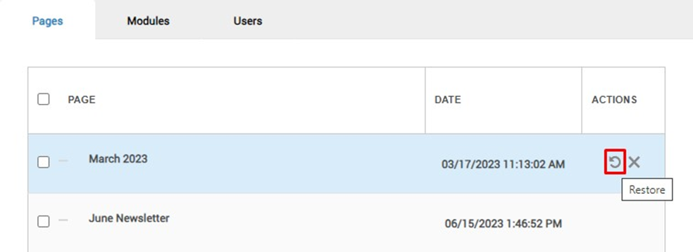
Restore a Deleted Page/Module
If a page or module has been deleted and needs to be restored, find the page/module in the list within the recycle bin. Hover over the right-hand column under Actions, then click the circular arrow icon to restore the page/module.
Deleting a Deleted Page
If adding a page and an error message pops up saying the page already exists but it is not visible in the pages menu, check the recycling bin. To proceed with creating a page with the intended name:
- Permanently delete the page in the recycling bin and create a new page, or
- Restore the existing page from the recycling bin for use.
Site Assets/File Manager
Under the Manage icon in the left-hand admin toolbar click on Site Assets. The Site Assets section of the website is where all images, documents and videos are uploaded and stored for the website.

Classic View
On the left-hand side of the file manager is the list of folders containing site assets. On the right-hand side are the sub-folders and files within the folder that is currently selected.

At the top of the right-hand side there are several option buttons:
Under Views
From left to right, the button actions are:
- File manager open and close
- View folders and files in a grid layout with icons
- View folders and files in a list layout with additional details
- Refresh/sync the folder to update the contents
Under Actions
From left to right, the button actions are:
- Upload an asset.
Note: When clicked, you will be prompted to either drag and drop a file or click in the light blue area to browse your computer for a file.
- Create a new folder in the file manager.
Note: The folder will be added in whichever existing folder you are currently in.
- Manage folder types
Note: You do not need to make any adjustments to the existing folder types.
If a file is selected, (the box to the left of the file is clicked), additional options appear.
From left to right these buttons allow one to download, rename, copy, move, delete, view file properties and capture the URL for the selected file. The file name can also be right clicked on and a popup for the same options will appear.
Updated View
The landing page of the updated File Manager has three action buttons, then below that a search followed by large icons for the folders and assets in the Root Folder.
Action Buttons
- Manage Folder Types: This button allows one to manage the folder types.
Note: You do not need to make any adjustments to the existing folder types.
- Add Folder: This button allows one to create a new folder in the file manager.
Note: The folder will be added in whichever existing Folder you are currently in.
- Add Asset: This button allows one to upload an asset.
Note: When clicked, you will be prompted to either drag and drop a file or click in the light blue area to browse your computer for a file.
File Actions
Hovering over a file will bring up additional options on the right-hand side of the file.
These actions from top to bottom are:
- Edit: Allows the file to be renamed, and the title/description of the file to be edited.
- Copy: This button will copy the URL for the file.
- Move: Allows the file to be moved to a different folder.
Note: If the file is already linked somewhere on the website, this will break the link to the document or cause the image to not be displayed. - Download: Will download the file to the admin’s computer.
- Delete: Will delete the file from the File Manager.
Newest View
The most recent version of DNN has a different layout and the action buttons function differently.
Resource Manager
Select the folder you would like to add images or documents to from the file list on the left-hand side. Double click to select.
Once you have selected the folder, the action items from left to right are:
- Add Folder: Click to add a folder to the inside the selected folder.
- Upload: Click to upload a file to the selected folder.
- Search Bar: Search for file in the selected folder.
- Sort: Arrange files in the selected folder by name, date created, last modified date or file size.
- Sync: Checks the backend for new files/folders that were not added via the file manager.
- View: Toggles layout between list and icons.
Note: If you do not see this action menu, it is because you have a file selected. Clear the selection by clicking the X next to the items prompt in the toolbar.
File Actions
Clicking on a folder or ticking the dot to the left of the filename brings up the main action menu at the top of the module.
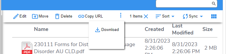
Menu actions include:
- Edit: Choose to rename the file or folder.
- Move: Select to move the file to a different folder.
- Delete: Select to delete the file.
- Copy URL: Saves the image or file url to the clipboard.
- Download: Downloads a copy of the file to the admin’s local drive.
Right clicking on any file will automatically select it and bring up a second version of the action menu that has the same functions as the main action item.

Folder/Site Asset Tips
Adding an Asset
To add an image or file to a folder, click into the folder content needs to be added to. If the asset was just uploaded to the Sites Assets main landing page, it will be added to the website’s main Root Folder, which is a catchall. Uploading assets into folders relevant to the asset type or content is highly recommended to keep the Site Assets main folder organized.
Proper File/Folder Naming
When uploading assets or creating folders, remove all spaces from the file/folder name or replace the spaces with a hyphen or underscore. If spaces are left in the folder/file name, the spaces will be replaced with “%20”. In addition to spaces, remove all special characters (e.g., parentheses, quotes) as these can break file URLs.
Good:
Title: PD2023_SessionGrid
URL Output: https://www.aprahome.org/Portals/0/PD2023_SessionGrid.pdf
Bad:
Title: PD 2023 Session Grid
URL Output: https://www.aprahome.org/Portals/0/PD%202023%20Session%20Grid.pdf
Pre-Assigned Folders
During the development of the website, ITS creates folders for the siteskin, templates, documents and images — do not remove or rename these folders.
Modules
Adding a New Module
To add a new module, start by going to the page the modules should be added to. Using the bottom admin toolbar, click the left button with a cube on it.

In the popup window, click on the module type that should be added to the page. In most cases, the HTML module will be selected.

The module will then float on the page allowing it to be dragged and dropped it into a content pane on the page.

Adding an Existing Module
DNN allows existing modules to be added to other pages on the website. To begin adding an existing module, click the middle icon in the bottom admin toolbar.

A popup window will be displayed that has a Page dropdown and then a checkbox that says “Make a copy”.
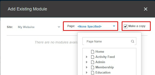
This checkbox is important as it allows admins to add two different types of existing modules:
- If the checkbox is checked, the module being added will be a duplicate of the module selected.
- If the checkbox is unchecked, the module being added will be a duplicate of the module but the two modules will be “shared” meaning any updates made to the module on one page will also be made to the module on any other page it is shared with on the website.
Tip: This is useful for content that you want to be the same on multiple pages (like a conference banner) but you don’t want to have to manually update across all of the different pages.
In the popup window, click the page dropdown. The dropdown will show the page hierarchy, listing all of the pages on the website. Select the page with the module that is to be copied from the list.
Once the page has been selected, all of the modules on said page will be listed. Click the module that is to be copied. It will then float on the page allowing it to be dragged and dropped into a content pane on the page currently being working on.
Tip: If you uncheck the “Make a copy” checkbox, you can tell the module is a shared module by hovering over the module in the content pane and looking at the top right corner. It will say “Shared Module: Title of Module”:

Deleting a Module
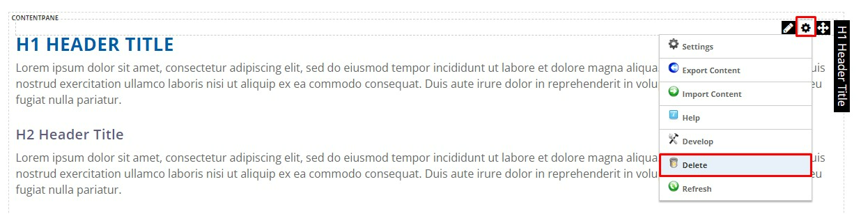
To delete a module, hover over the middle gear icon found in the upper right corner of the module and in the dropdown menu that appears select Delete.
Tip: If you accidentally delete a module, you can restore it from the Recycle Bin.
HTML Module
Editing Content
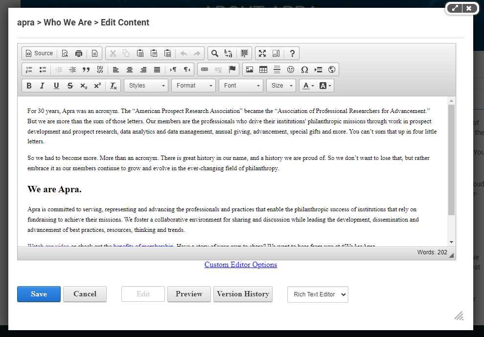
To make standard updates to a module, whether it is to copy, images, buttons, or videos hover over the pencil icon that appears in the upper right-hand corner of the module and click “Edit Content.” Once clicked, the WYSIWYG (what you see is what you get) Editor will pop up with a toolbar of options at the top.
Toolbar Buttons
What follows is a breakdown of the common editing actions performed using the toolbars at the top of the WYSIWYG Editor. Actions not listed below should not be used.
Top Row Left to Right:

- Source: When clicked, the content editing box changes to source code that can be edited.
- Printer: Print content.
- Scissors: When text in the content box is highlighted with the mouse, this will darken and allow the text to be cut out.
- Two Papers: When text in the content box is highlighted with the mouse, this will darken and allow the text to be copied.
- Clipboard With Paper: For pasting copied text.
- Clipboard With T in Box: For pasting as plain text.
- Clipboard With W in Box: For pasting from Word.
- Arrow Pointing Left: Undo previous action.
- Arrow Pointing Right: Redo previous action.
- Magnifying Glass: Find content.
- B to A: Find and replace.
- Highlighted Document: Select all.
- Arrows Pointing Out: Maximizes the content area when clicked.
Middle Row Left to Right:

- Number List: Creates a numbered list in the text; each time “Enter” is hit on the keyboard the next number will be created.
- Bulleted List: Creates a bulleted list in the text; each time “Enter” is hit on the keyboard a new bullet point will be created.
- Arrow Pointing Left, Lines to the Right: Decrease indentation.
- Arrow Pointing Right, Lines to the Left: Increase indentation.
- Lines Aligned Left: Aligns content to the left of the page.
- Lines Centered: Aligns content to the middle of the page.
- Lines Aligned Right: Aligns content to the right of the page.
- Lines Evenly in a Row: Justifies content.
- Triangle With P: Text direction will be from left to right.
- P With Triangle: Text direction will be from right to left.
- Link: Opens hyperlink popup window to add or edit a link.
- Link With X: Unlink a hyperlink in the text.
- Flag: Add an anchor link (see video on page 29).
- Picture of Sun and Mountains: Add an image.
- Table: Create a table; Customize size and cell counts on the Table Properties tab.
- Bolded Horizontal Line: Inserts a horizontal line the width of the page.
- Omega: Special characters options.
- Globe: Inserts an Iframe (see Iframe on page 36).
Bottom Row Left to Right:

- B: Bold text.
- I: Italicize text.
- U: Underline text.
- S: Strikethrough text.
- X With 2 in Bottom Right: Subscript text.
- X With 2 in Upper Right: Superscript text.
- T With X in Bottom Right: Remove text format.
- Normal Dropdown: Pre-set headings styles (H1-H4).
- Underlined A: Use to change the color of text.
- A in a Box:Use to add a background color behind select text.
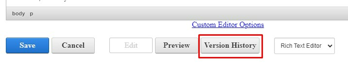
Version History
If changes that were made to a module need to be reverted, use the Version History button to roll back the module to a previous version. Click the Version History button to view current and recent past versions.
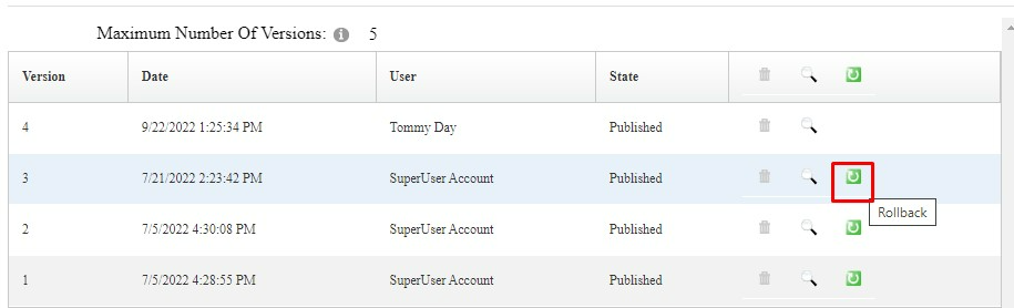
To delete versions, click the trash can icon. To review previous versions, click the magnifying glass icon. To revert the webpage to a previous version, click on the green box with an arrow.
Adding Hyperlinks
When the link button in the toolbar is clicked, a popup box appears. On the Link Info tab of the popup box, add in display text (the text that will be linked), select the type of link (email, anchor, URL, portal file, portal page) and add in the URL or phone number of choice.

On the Target tab, set where you would like the hyperlink to open when a user clicks on it. In most instances, the target will only need to adjusted if the hyperlink should open in a new window.

On the Advanced tab is where the class to turn a link into a button is to be added. To do this, type “button” into the Stylesheet Classes section.

Note: On websites with more than one button style, reference the Styles page to determine which type of button should be used. To determine the class for a secondary button style, edit the content on the Styles page, place the cursor on the link with the style you want to use, click the link button in the toolbar to open the link window, click the Advanced tab and copy the text listed in the Stylesheet Classes text box.
For additional guidance on adding anchor links, watch this tutorial.
Adding an Image
To add an image to a module/page, place the cursor in the editor where the image is to be added. Then click the image toolbar icon.
If the image has already been uploaded to Site Assets, copy the relative URL into the URL text box. The relative URL is everything after the domain. For example, the highlighted portion of this URL:
https://www.aaohn.org/portals/0/images/zsvqsfgc.jpg.
If the image has not been added to Site Assets yet, click the “Browse Server” button. This will the image to be uploaded and the URL for the image to be pulled.

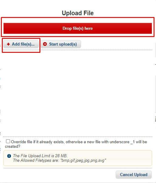
A new window will pop up, showing the Site Assets. Use the folder structure on the left to navigate to the folder the image is to be uploaded to. Click the icon at the top with the blue arrow pointing up to upload the image.

Drag and drop the image from the computer into the red box or click the “Add File(s)” button to select the image directly from a computer. Click the Start Uploads button.
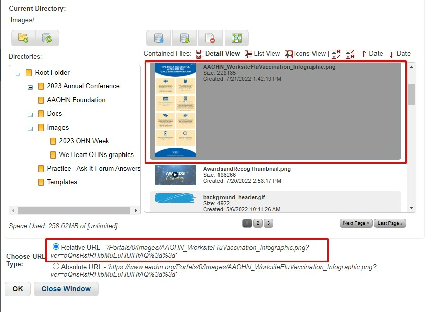
Once the image is uploaded, the window will close. Return to the Site Assets popup window and find and click on the image in the folder it was uploaded to. With the image selected, the URL should be towards the bottom of the window. Leave the Relative URL radio button selected and click OK.
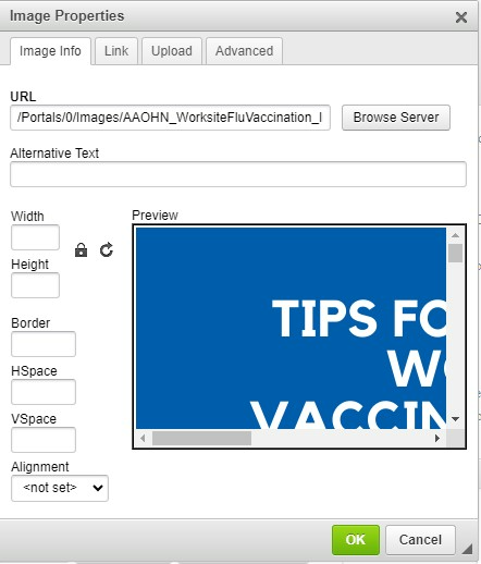
The Editor with the Image Properties window still open and the image URL filled in will then appear.
In order for an image to be responsive, clear out the fixed width/height numbers set on the image. This will allow the image to scale appropriately with the size of the browser/device. To do this, delete the numbers in those boxes.
Before:

After:
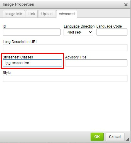
To finish making the image responsive, click on the Advanced tab of the Image Properties window. In the “Stylesheet Classes” textbox type in “img-responsive.”
Return to the Image Info tab and in the “Alternative Text” box enter in a description of the image. This is used for accessibility and those with screen readers who may not be able to see the image.

Click OK to insert the image onto the page.
Important Tips for Images:
- In order for images to be responsive make sure there are no set values for the width and height in the Image Info tab. This along with the img-responsive class will allow the image to scale with the size of the user’s browser.
- Before uploading images to the site, resize the images to the maximum size you’d like them to be displayed. The image should have a maximum width of the width of the content area, and if it is not a full width image like a banner it should be less than the width of the content area. You can refer to the Styles page of the site for the content width or ask the IT Support Center if it is not listed there.[MH3] [TU4] In general, your images should be no more than 1200px wide.
- Use web resolution (72 DPI) not print quality resolution (300 DPI) images. Using very large images or high-resolution images can cause a webpage to load slowly, resulting in bad UX (User Experience).[HM5] [TU6]
- Do include alt text. The text should convey the purpose of the image or at a minimum describe the image. Read more on this here.
Adding a Video
There are two options to add in a video to the content editor:
- Option 1: Upload a video as a site asset to the backend of the website, then proceed to add the video as an iframe embed. Pull the code from the site asset by clicking on the clipboard icon that appears when hovering over the asset and copying the URL from “https” through “.mp4.” Add this part of the URL to the URL box in the iframe popup.

- Option 2: Embed code from an external website into the webpage’s source code. Typically, code can be pulled from the share option for each video on websites like YouTube
Note: Podcast embeds should follow this option for embedding.
Module Settings
The Module Settings can be accessed by hovering over the right-hand corner of a module, hovering over the gear icon and clicking Settings in the dropdown menu.
Note: The only items in this dropdown menu that should be used are the Settings and Delete options.

In the Module Settings popup window, there are several tabs at the top. Below are the items of note from each tab.
Module Settings Tab
Under Basic Settings there is a text box called “Module Title”. This is the header at the top of the module. It can be edited here in the Module Settings, or oftentimes, it can be edited directly on the frontend of the webpage.

Permissions Tab
On the Permissions tab, set which specific roles should be able to view the module. Typically, a module will have the “Inherit View Permissions from Page” checkbox selected, meaning that the module doesn’t have any specific/different permissions than the page itself.
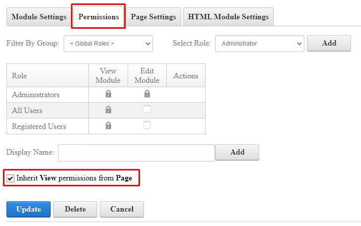
If a module needs to be visible only to members or another role on the website, first uncheck that checkbox to make the module admin only. To give additional roles the ability to view the module, click the “Select Role” dropdown and select the role. Then click the Add button.

That role will then be added to the module permissions list with View capabilities.

Note: If you are creating a members only module, you will also want to set up a module for non-logged in users (Role = Unauthenticated Users) so that if a member is not logged in they know to log in to view the information on the page. You will also want to set up a module for non-members (Role is typically called Non-Member) in order to let non-members know they need to join in order to view the information on the page. You may also contact your ITS Client Manager or the Support Center for assistance with setting this type of page up.
Page Settings Tab
On the Page Settings tab under “Basic Settings” there is a field called “Module Container”. This allows a module container to be selected, which is essentially the template of the module.

Typically, most websites will have two containers, though some website may have more. The two typical containers are “Main Container” and “Invisible”. The main container will have a header at the top that will display the module title. The invisible container will not have this header/module title. The Module Container will default to the Main Container, but if this needs to be changed, select Invisible Container in the dropdown. In the dropdown it will be listed as “Host: SiteSkin – Invisible.”

[MH1]Should add an item abut the indexing for google here if you have a hidden or archived page
[TU2]Just add that if they have a hidden or archived page they should turn indexing off? By default hidden pages aren't included in the sitemap so aren't indexed
[MH3]Should we add suggested tools for editing and/or suggested sizing for graphics? Slippery slope here but then could have them reference their style page for guidelines?
[TU4]I would need to ask some MCS folks what they typically use for editing graphics since I use Photoshop. I could add that the max image width should be no wider than their content area width and we could include that width on the styles page?
[HM5]Do we also want to add the html tag for img-responsive?
[TU6]As in class="img-responsive" ? It is mentioned above bc I think 95% of folks aren't editing in the HTML but I can add it here as well.
Was this article helpful?
That’s Great!
Thank you for your feedback
Sorry! We couldn't be helpful
Thank you for your feedback
Feedback sent
We appreciate your effort and will try to fix the article